


Table of contents
- Introduction
- Why is Cropping Important?
- Why Use CSS to Crop Images?
- The Different Methods of Image Cropping
- 1. The <img> Tag with object-fit and object-position
- 2. The background-image Property with background-size and background-position
- 3. Image with Persistent Ratio
- 4. Round Cropping Using border-radius
- 5. Complex Paths of Cropping with clip-path
- 6. CSS Grid for Image Cropping
- 7. CSS Transform Property for Image Cropping
- Effortlessly Crop Your Images Online with ImageKit
- Conclusion
Introduction
In the dynamic world of web design, image cropping has become a vital skill for developers aiming to create visually captivating and well-structured websites. Cropping is the process of removing certain regions of an image and reducing image size accordingly.
By leveraging the power of CSS (Cascading Style Sheets), developers can effortlessly crop and manipulate images to achieve their desired visual effects. This comprehensive guide will explore various CSS techniques and properties that enable efficient image cropping.
This article gives thorough insights for developers and designers about different methods of image cropping. Beyond that, we shall also examine how to use the most powerful image solution — ImageKit.
Why is Cropping Important?
The need for image cropping arises from the desire to focus on specific areas or subjects within an image. By carefully selecting the portions that matter most, developers can enhance the impact of their visual content and direct the viewer's attention.
Whether highlighting a product on an e-commerce site or showcasing a key element in a portfolio, cropping allows for concentration on a specific area or subject, resulting in more impactful communication.
One of the primary benefits of image cropping is removing unnecessary information or distractions. By eliminating unwanted elements, developers can create cleaner and more compelling compositions, leading to improved user experience.
This is particularly important in responsive web design, where limited screen space necessitates efficient use of the visual real estate.
Image cropping enables designers to create odd shapes that catch the viewer's attention.
Likewise, developers can create distinctive compositions that stand out from the crowd by judiciously cropping an image. CSS allows developers to shape and mould pictures to fit their design targets, whether it's a circular avatar or a custom-shaped hero image.
Why Use CSS to Crop Images?
CSS provides a range of methods for image cropping, each with its own advantages. This guide will teach you how to apply properties such as background-size, clip, masking, overflow, and transform to achieve effective image cropping.
These techniques offer flexibility and control, ensuring your web designs stand out with precision and finesse.
Join us as we embark on a journey through the world of CSS image cropping, and unlock the potential to craft captivating web experiences.
From focusing on specific subjects to removing distractions and accommodating unusual shapes, CSS empowers you to create visually stunning and engaging websites that leave a lasting impression.
Additionally, we will explore how ImageKit, a cloud-based image transformation tool, can further enhance the image cropping process by providing efficient solutions to load pre-cropped images hence, optimizing your website's performance while delivering visually appealing content.
The Different Methods of Image Cropping
1. The <img> Tag with object-fit and object-position
In HTML, images are considered replaced elements defined by the <img> tag. Like most HTML tags, the <img> tag accepts attributes. These attributes determine how the image is rendered.
The <img> tag combined with CSS properties like object-fit and object-position provides a straightforward approach to image cropping. By controlling the size and position of the image, you can effectively crop it to fit within a designated area.
This method is especially useful when working with images directly embedded in the HTML structure. The object-fit allows you to place an image(object) in a given container. It also accepts the following values:
contain
cover
fill
inherit
initial
none
revert
scale-down
unset
<img src="./assets/doggo-asset.jpg" style="object-fit: cover; width: 300px; object-position: 30px 31px;" alt=" Cropped Image">
In this example, the object-fit: cover; property ensures that the image covers the entire container while maintaining its aspect ratio. The object-position: 30px 31px property helps position the image.
To explore more examples of different object-fit settings and positions, you can check out this CodePen. It offers additional demonstrations that will give you a better understanding of how the object-fit property works in various scenarios.
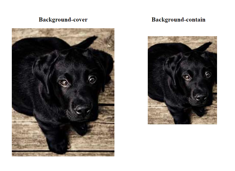
2. The background-image Property with background-size and background-position
Another approach to image cropping involves using the background-image property in conjunction with background-size and background-position. This method is particularly useful when setting images as backgrounds instead of directly embedding them in the HTML structure.
Here are two examples:
.element-1 {
  width: 400px;
  height: 500px;
  background-image: url('./assets/image7.jpg');
  background-size: cover;
  background-position: top right;
}
.element-2 {
  width: 400px;
  height: 500px;
  background-image: url('./assets/image7.jpg');
  background-size: contain;
  background-repeat: no-repeat;
}
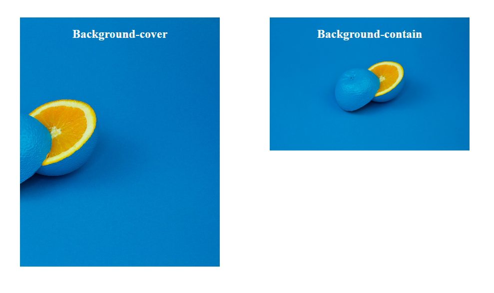
In the first example, background-size: cover scales the image proportionally to cover the entire background area, preserving its aspect ratio. The background-position: top right aligns the image to the top right corner of the element.
In the second example, background-size: contain scales the image to fit within the background area while maintaining its original aspect ratio. The background-repeat: no-repeat ensures the image is not repeated within the background.
By adjusting the background-size and background-position properties, you can achieve different cropping effects and control how the image appears as a background. Using the background-image property with background-size and background-position offers flexibility in cropping images as backgrounds.
3. Image with Persistent Ratio
The aspect ratio of a screen or display is the proportional relationship between its width and height.
To maintain the aspect ratio of an image while cropping, you can use CSS techniques that involve giving the container element fixed dimensions and using automatic dimensions.
.image-container{
    width: 400px;
    height: 300px;
}


#image-1{
    width: auto;
    height: 70%;
}


#image-2 {
  width: 70%;
  height: auto;
}
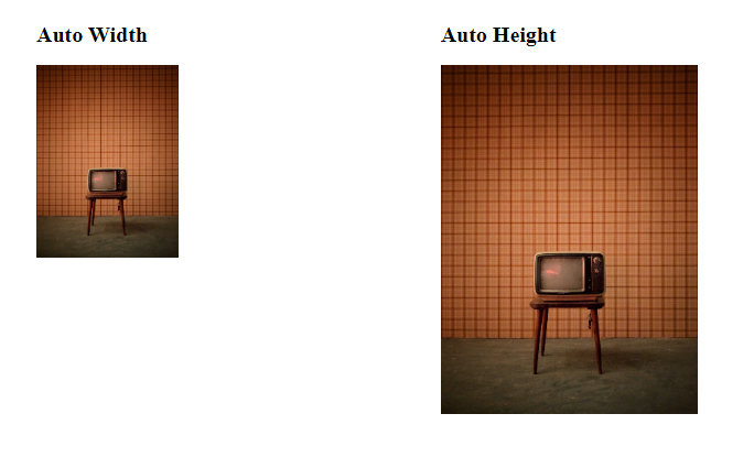
In this example, the container has fixed width and height, the easiest way to maintain the aspect ratio is to manually set the width of the image, then set height: auto (or vice-versa).
The browser will automatically calculate the dimensions while retaining the aspect ratio within the container.
4. Round Cropping Using border-radius
The border-radius property is commonly used to create rounded elements, including circular or elliptical-shaped images. By setting the border-radius value to a value greater than 50%, you can achieve rounded image cropping.
.round-image {
  border-radius: 50%;
  width: 200px;
  height: 200px;
}
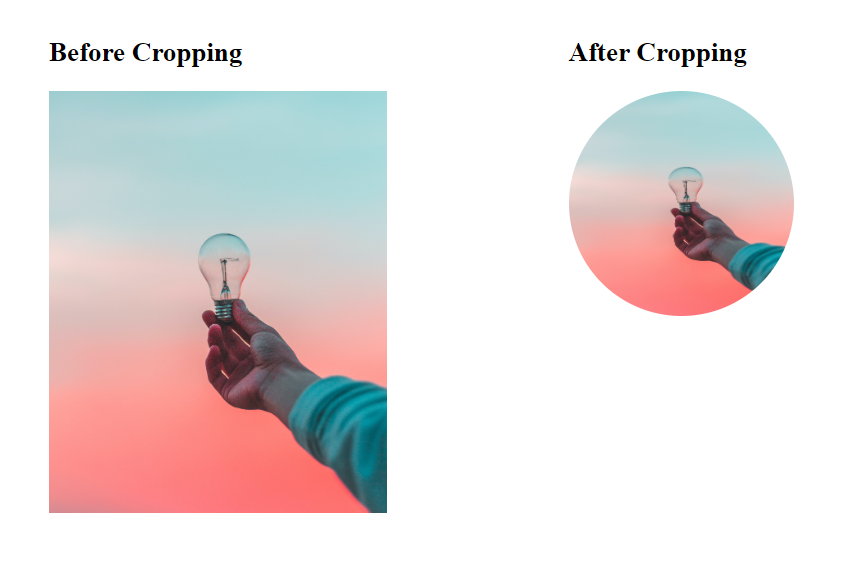
In this example, the border-radius: 50% creates a circular crop, and the width and height properties determine the dimensions of the cropped image.
5. Complex Paths of Cropping with clip-path
For more advanced and custom cropping shapes, the clip-path property comes into play. It allows you to define complex clipping paths using CSS.
.custom-crop {
  Width: 300px;
  clip-path: polygon(0% 0%, 100% 0%, 75% 100%, 25% 100%);
}
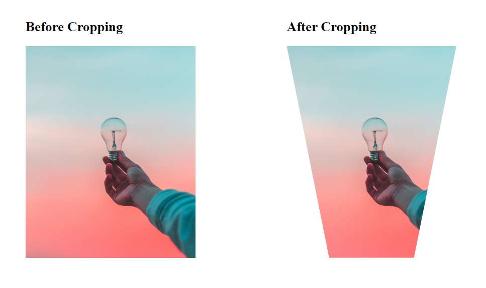
In this code snippet, the clip-path property is used with the polygon() function to create a custom crop shape. The coordinates specified within the function define the shape of the crop.
6. CSS Grid for Image Cropping
CSS Grid provides a powerful layout system that can be utilized for image cropping. By setting up a grid container and defining the size and position of grid items, you can crop images within specific cells.
.grid-container {
  display: grid;
  grid-template-columns: repeat(3, 1fr);
  grid-gap: 10px;
  width: 400px;
  height: 500px;
}

.grid-item img {
  width: 100%;
  height: 100%;
  object-fit: cover;
}

In this example, a grid container with three columns is created, and each grid item contains an image that covers the entire cell using object-fit: cover. Adjust the number of columns and grid-gap value according to your layout requirements.
7. CSS Transform Property for Image Cropping
The CSS transform property, combined with translation, scaling, and rotation functions, can be used to crop and transform images.
.transform-image {
  transform: scale(0.5) translateX(50px) rotate(20deg);
}

In this example, the transform property is used to scale the image to 50% of its original size, translate it horizontally by 50 pixels, and rotate it by 20 degrees. Experiment with different transform functions to achieve the desired cropping and transformation effects.
By exploring these different techniques, you can choose the most appropriate method of image cropping based on your specific design requirements. Experimenting with combinations of these techniques can also result in unique and creative effects.
Note: Remember to adapt the code examples and adjust the values according to your specific needs and layout requirements. Here is a repo for this tutorial.
Effortlessly Crop Your Images Online with ImageKit
While CSS provides various methods for image cropping, such as using the <img> tag, background images, and CSS properties like object-fit, border-radius, and clip-path, there is one drawback to consider: when using CSS for cropping, the full-sized image is still downloaded to the browser before being cropped. This results in higher bandwidth usage and longer page load times, especially when dealing with large or high-resolution images.
ImageKit is a powerful solution that addresses this limitation and optimizes the image cropping process. It is an image transformation tool that streamlines the process of cropping, customization, and optimization for business needs. It offers a comprehensive range of image transformation capabilities and provides over 50 transformations, including cropping, resizing, compression, and more.
One of the key features of ImageKit is its extensive crop options. It offers various crop modes such as Pad resize crop strategy, Forced crop strategy, Max-size cropping strategy, and Max-size-enlarge cropping strategy, allowing you to choose the perfect crop strategy for your images. Additionally, ImageKit provides different focus strategies like auto, face, top, zoom, and more, which ensure that the important parts of your images are always in focus, even after cropping or resizing.
Conclusion
In conclusion, CSS provides a range of techniques for image cropping, allowing developers to control their web designs and create visually appealing websites.
CSS offers flexibility and options to achieve effective image cropping as each method provides its own set of advantages, and can be combined with other CSS properties and techniques to create visually appealing and engaging web designs.